Screenshot
There is something undeniably attractive in small ideas executed with precision and clarity. In receiving Cintia Tortosa Santisteban’s new book Screenshots from a series of videos about a rice field and its surroundings (Chose Commune, 2025), I am reminded that it is often the Occam’s razor of production and concept that produces some of the greater exchances of communication in the arts. Instead of overcomplicating ideas or running a specious political narrative through the material, Tortosa Santisteban opts, with the compliments of her publisher, Cécile Poimboeuf-Koizumi, to bear down and look at the work from the perspective of clarity, namely, the title does what it says it’s going to do on the box. There are no clunky or pretentious leanings. There is no facade of over-stretching intellectualism.
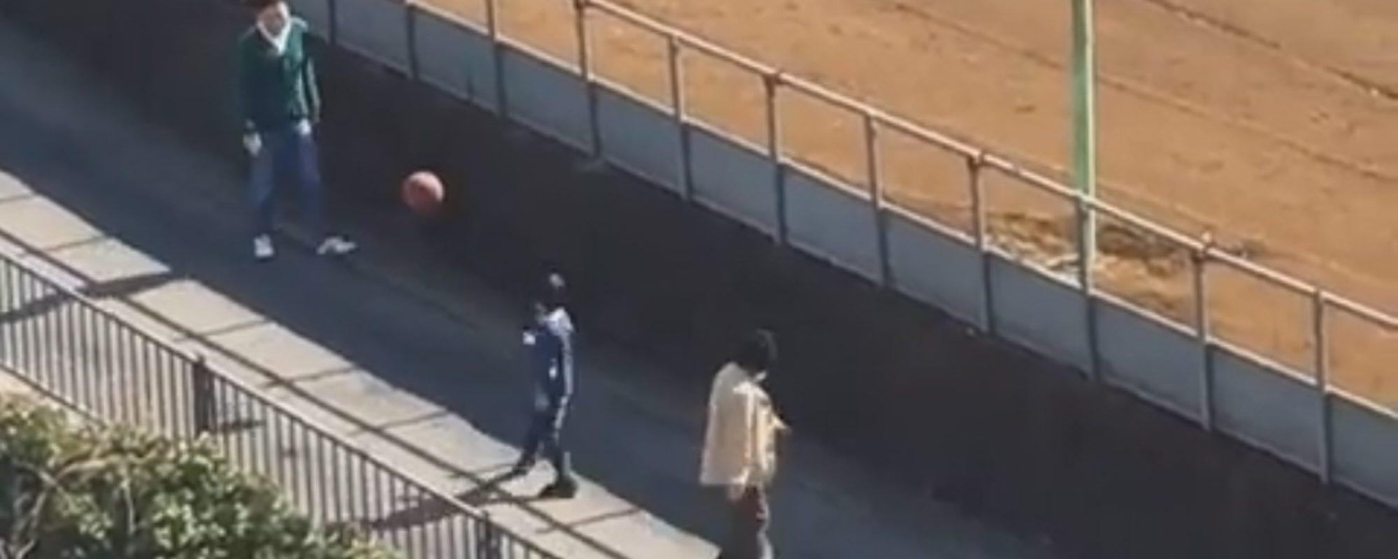
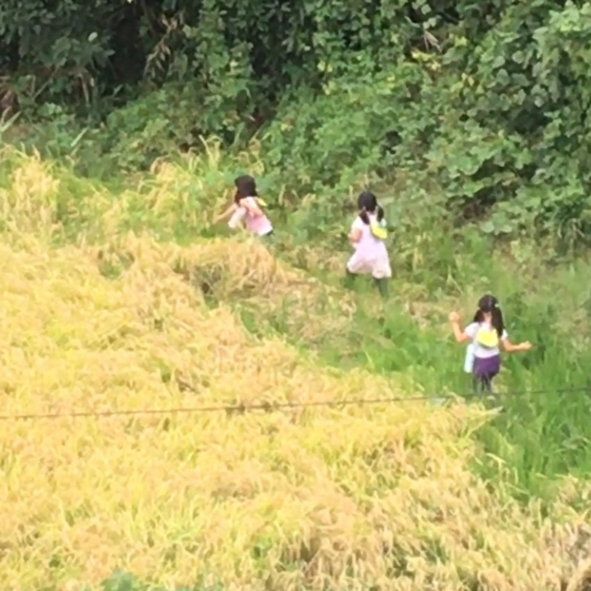
Instead, we have screenshots from a series of videos about a rice field and its surroundings. It’s almost comical to read it out loud in its length, but it instead presents a type of sincerity that is sorely lacking in much of what I come across. These screenshots, along with the book’s incredible design, offer the viewer a glimpse into what lies beyond Cintia’s flat. The footage is slightly stretched and grainy. This is to be expected when working with video. In terms of the window, it follows a common trope in photography of window projects that I believe are plentiful enough to produce a fascinating exhibition, looking back from Niepce and Daguerre, through Brassaï, Kertész, Ruth Orkin, Robert Frank, and more recently Seiichi Furuya, and Hayahisa Tomiyasu’s exceptional TTP (MACK, 2018). I could name many more, but Cintia’s book fits brilliantly into this pantheon of work, which considers a view on the world as essential to the production of value.
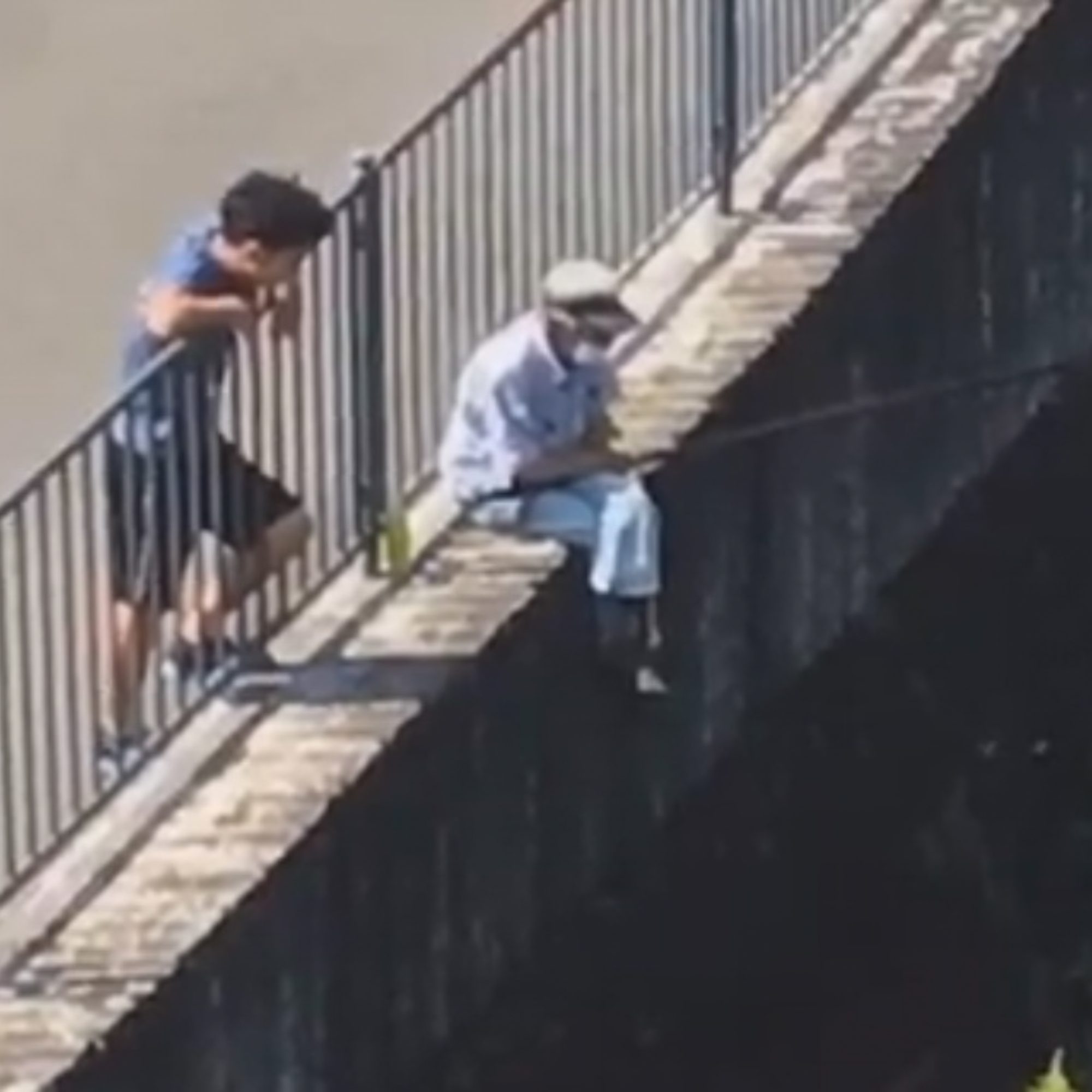
The book is not without a more intricate webbing of concepts. After all, Cintia, a Spanish artist living in Japan, is perched in her flat making daily video observations of labor and the everyday goings-on of life in Japan, where she resides. The video footage is stretched, grainy, and impure. It leads us to consider the tenuous grip of reading things too closely. There is a slight distance between the author and the subject, which raises more questions about what constitutes the balance. There is a suggestion of voyeurism from the point of view, but that is largely ingrained in us through the notion of Bentham’s Panopticon (reiterated by Barthes) and its suggestions about surveillance. However, in Cintia’s work, there are no close-ups.
Screenshot
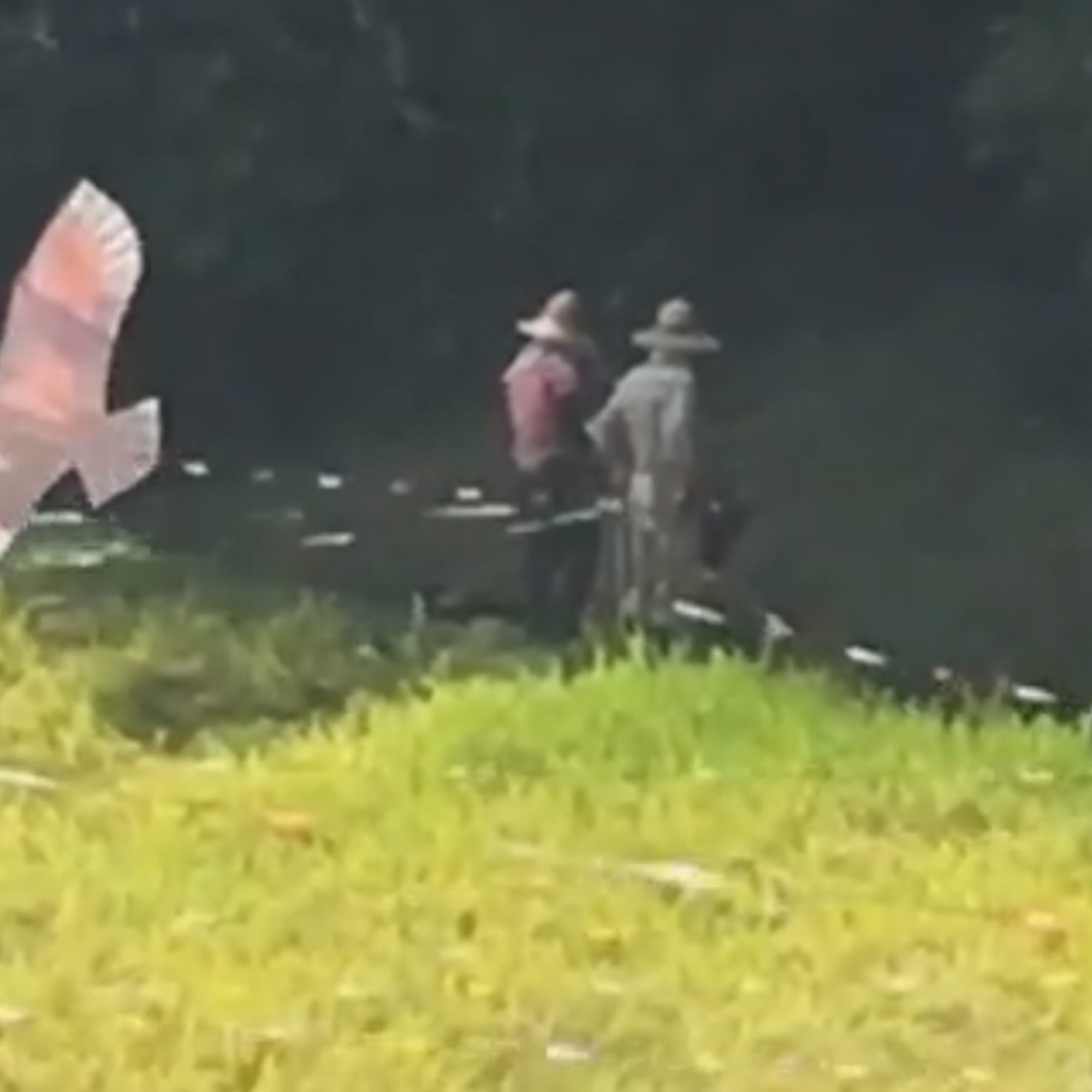
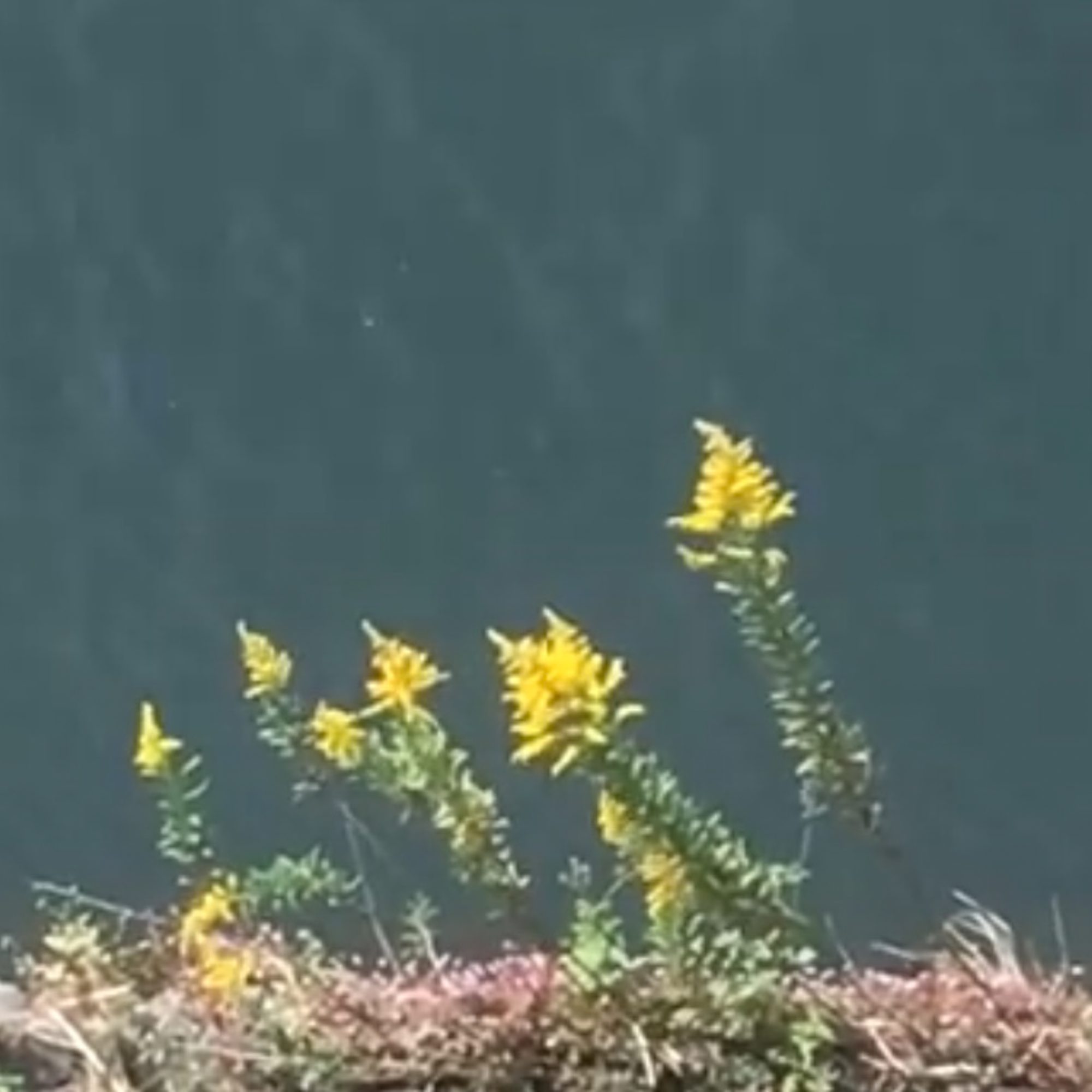
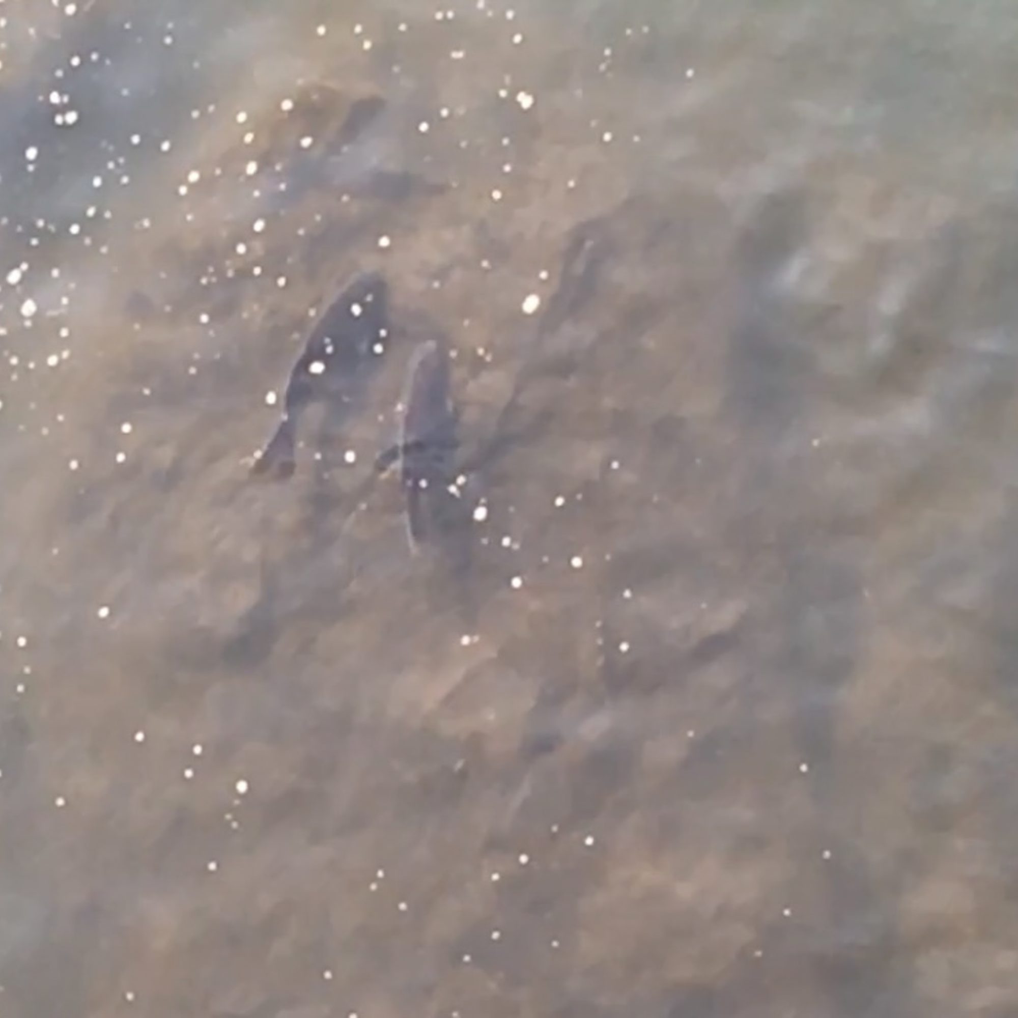
I am reminded here also of how fellow Spaniard Salvi Danés’s book, A les 8 al bar Eusebi, maximizes this same feeling, though with more cinematic overtones. What Cintia does with her video telegraphy is to suggest an ephemeral passing by in which nothing significant or spectacular happens. It is a formal type of people watching that expects nothing and, in turn, quantifies the experience to nonchalance, regularity, and near banality. And yet, on occasion, the view shifts and we find ourselves seeing images up close, which breaks the monotony of what would otherwise be a monotonous viewing. The photos are fuzzy like a fading memory, their edges frayed, and this also reflects the viewing condition of the work, not just the artist’s intentions in producing it. I feel they reflect a lucid state, dreamlike, and out of character with the hyper-realities promoted in our digital and screen-led world. There is something anarchic in their video-ness.
I find this quality, in particular, in the work of Shoji Ueda, such as Brilliant Scenes (1981). The stretch of the grain, the color palette, and the slight elevation of POV in both works make them, along with RFK Funeral Train by Paul Fusco, refreshing, unusual, and with the bonus of a type of phenomenon not often found in photography. It suggests movement and a reflexive co-observation in the case of Fusco and Ueda, but can also be assumed to some degree in Cintia’s work; her subjects are slightly less aware of her presence than in the work of Ueda and Fusco on the scale of observational exchange.
I keep coming back to Ueda in conjunction with Cintia’s book. I first came into contact with Ueda’s work through the same publisher, Chose Commune, when they released his eponymous book in 2015, before I had purchased the original edition. Ueda is a perfect example of an artist who fits very well with Chose Commune’s roster for reasons of simple elegance. More should be said about the choices CC makes in selecting their books; there is a sweetness to their catalog, one that does not territorialize the saccharine but also looks at fresh work. Yet, in its matter-of-factness and simplicity, it suggests a depth and reciprocity in daily human experience. It is above all, and it evades the spectacle consumption and regurgitation of so many of its peers’ offerings.
Screenshot
As for design, the book is one of the better projects that I have seen recently. Its diminutive size is a reflection of a few things. First, the screenshots can be upscaled in size, but are better presented in their original size, as that is what they are, and stretching them further would be a distortion of their technical reality. The bleed-off of the frame to the right-hand side is a fascinating choice, as it suggests a sense of continuity. Still, the reader is also forced to engage with the technical image/screenshot, a reminder of “real life” interacting with screen life. The book is also compact, reflecting the economy of photobooks in 2025. They are becoming expensive to produce, so this aligns with the larger shift away from larger books to smaller objects. There will be more small books coming, but what is important here is that the size reflects the work perfectly, much like Issei Suda’s Minox book, The Mechanical Retina on My Fingertips (ZenFoto, 2018). This book is best suited to its size in terms of the technology that underlies it.
With Screenshots, the artist and publisher have also employed an interesting use of faux-bamboo covers, which are supplemented by the use of a digital font, prompting the viewer to consider the interplay between the natural and technological worlds depicted within the images. The color and cover are suggestive of the rice fields they purport to represent. All elements are thought through, and the execution is superb. Here, the design serves the work while owning enough of the project to be considered a benefit, rather than an impediment through overdesign. This is particularly vital in a world where overdesign is beginning to lose its appeal.
Screenshot
This will undoubtedly be one of my favorite publications of the year and re-confirms (not that it needed much) my thoughts on the publisher and their vision. Slowly, Chose Commune continues to produce calm books with a profound clarity and humanity that I find exemplary. I am also indebted to their work in introducing me to Cintia’s fascinating work. I am very interested in whatever comes next from her. The book has my highest recommendation.
Screenshot